
Commercial Design
Corporate design need not be sterile.
Compelling design that delights clients & employees alike
Commercial spaces are, even years after the pandemic still feeling the repercussions, and a lot of companies have rethought & shrunk their real estate footprint. Employees have spoken, and the majority want a flexible policy with a combination of WFH and in-office presence. To encourage a return to the office, the design, comfort & use of these spaces are paramount to both recruitment and retention, with the ancillary social spaces even more important in creating a positive impact.
Both your clients and your employees want a welcoming environment that feels like home. Corporate design gets a bad rap for being too generic and bland, and in a lot of cases, they’re absolutely right. Jamie brings a much needed breath of fresh air to design with warmth & personality, and a cohesive approach, encompassing not only finishes, furniture and lighting, but accessories, artwork, plantings, & signage as well. These details go a long way to creating a compelling workplace that feels anything but sterile.
JRDS accommodates boutique-sized commercial projects, specializing in ancillary spaces such as lobbies, cafés, meeting areas, & C-Suite offices that reflect the company’s unique brand-story with a design that is tailored and personal. Are you ready to transform a ho-hum or cold office into a more functional, beautiful & inviting environment? Call us for a consultation!

California Pacific Orthopaedics
Design concept
“The unfortunate truth is too many healthcare lobbies look quite generic or cookie-cutter, and feel impersonal & cold in their aesthetic. When a patient may already be a bit nervous, they don’t want an environment that exacerbates their apprehension.
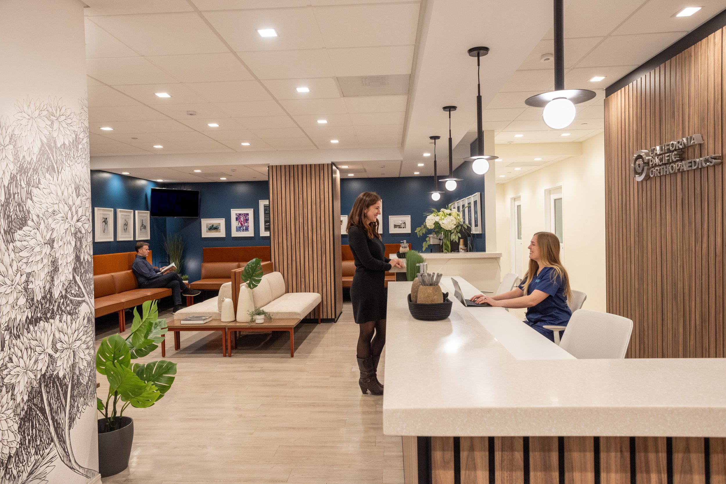
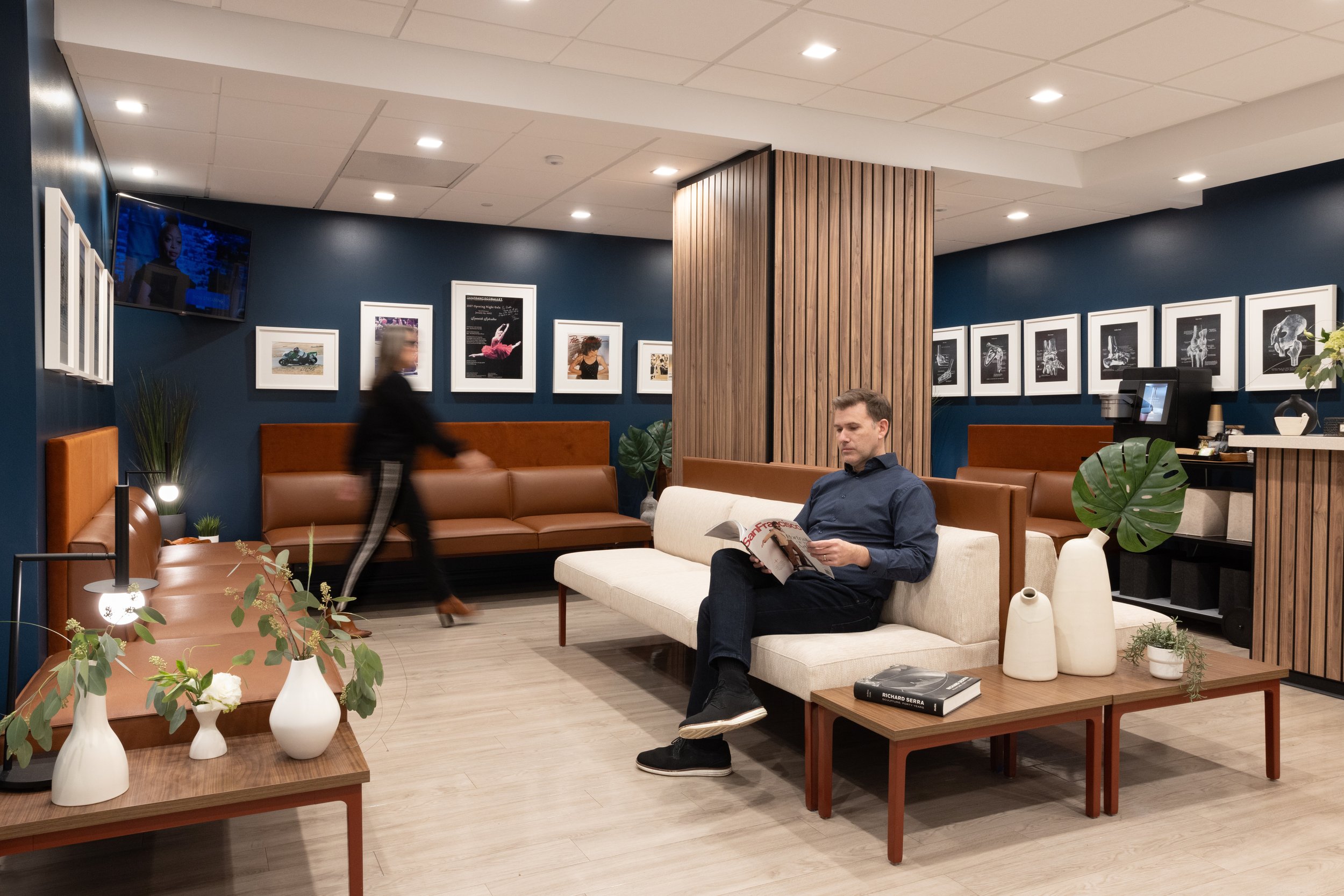
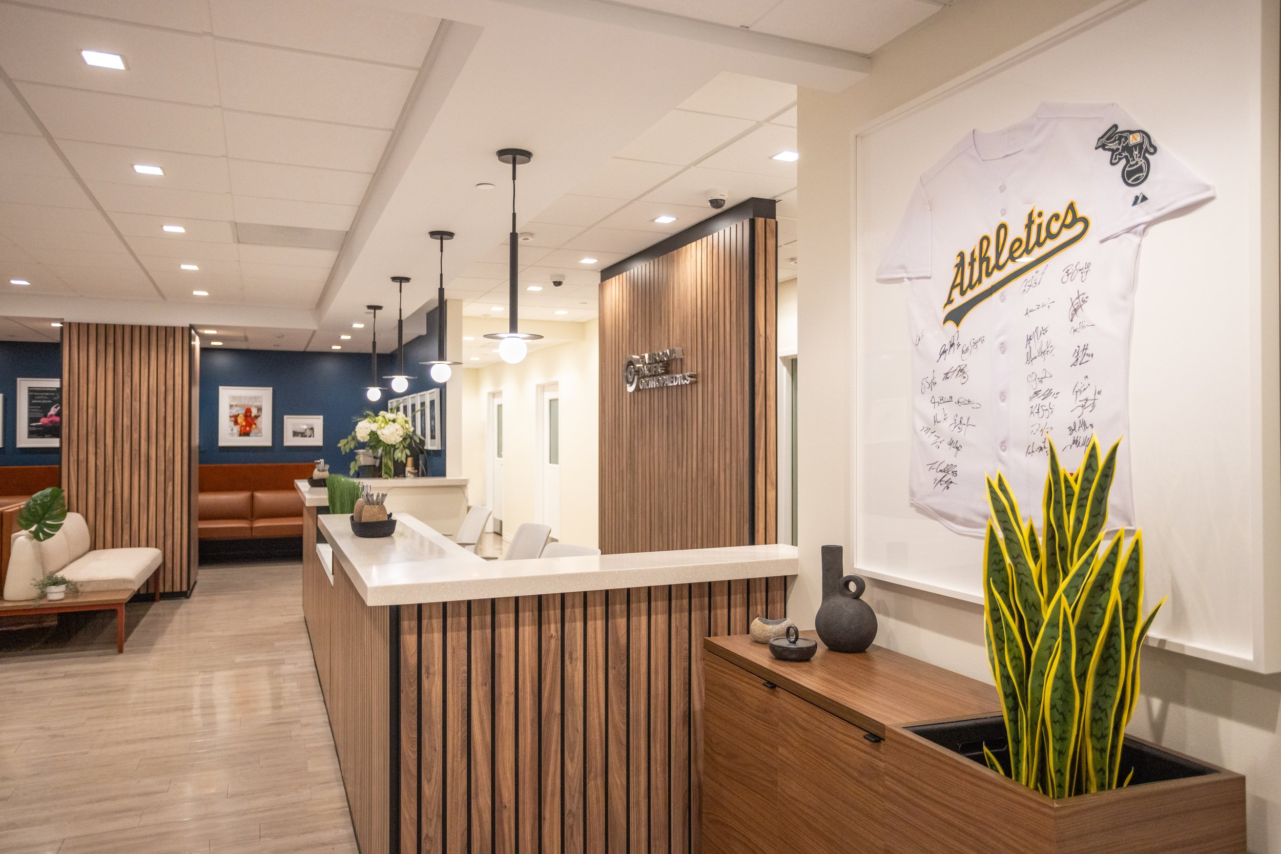
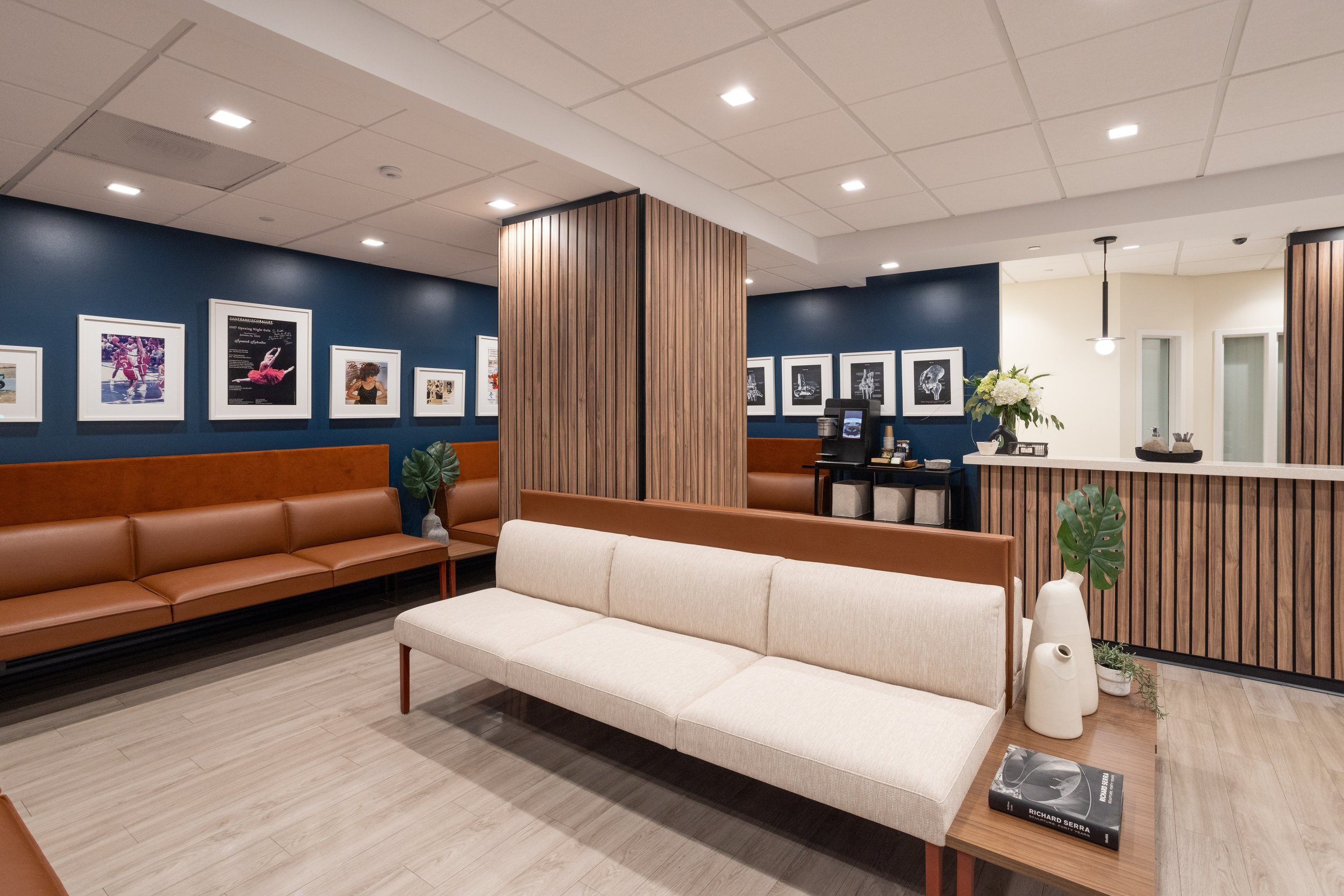
The intent of CALIFORNIA PACIFIC ORTHOPAEDIC’s lobby redesign was to both showcase their patient roster of many famous Bay Area athletes (from olympic skiiers to the SF Ballet to the Oakland A’s and more) who have all trusted CPO for decades, and to update & create a nature-inspired space that feels like a friend’s living room: welcoming, inviting, & that puts their clients at ease.
By the overwhelming positive feedback our client has received from patients & employees alike (as well as another project in the works), I’m grateful our team was able to achieve this aim. I love creating designs that feel good.”
— Jamie Ray


Before / After
-

Before
The existing desk & wall beyond had outdated colors and materials such as glass block & peeling laminate with less than impactful signage. The reception size was too small for CPO’s growing needs, and the finishes not durable for such an important focal piece.
-

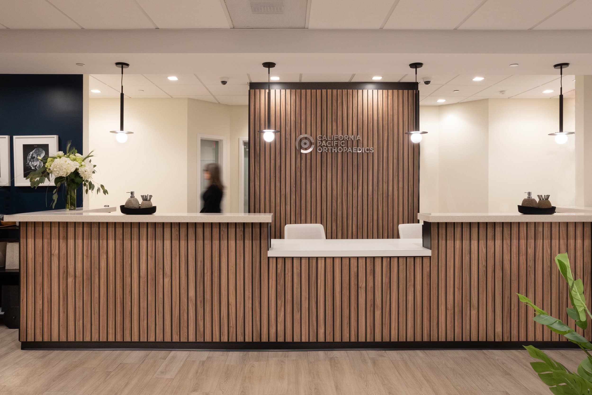
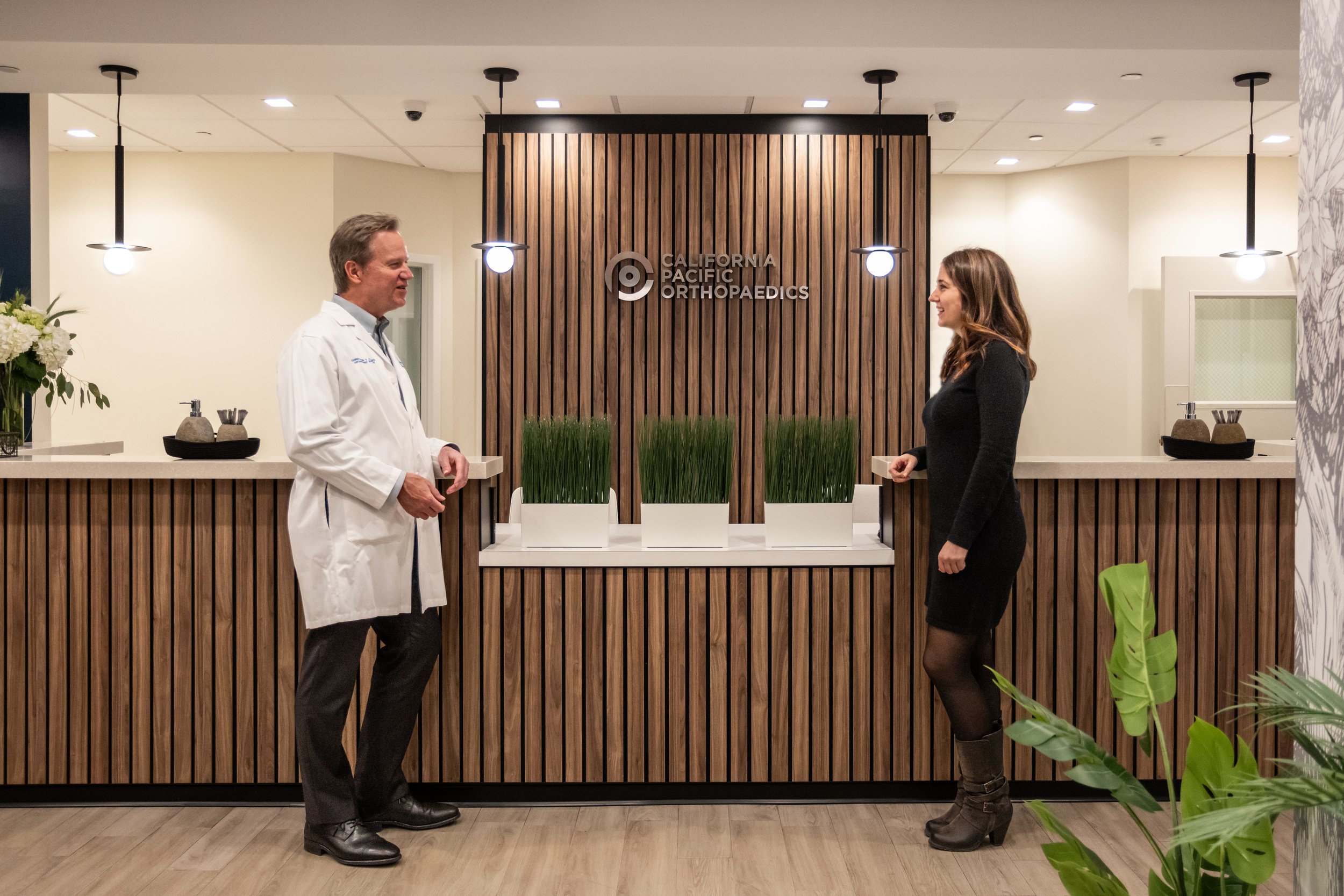
After
The desk was extended to accommodate another receptionist, straightened for a classic linear shape and clad in durable Corian for the transaction counter and warm walnut wood slats with custom signage in 3D brushed aluminum characters, accented by a new soffit and modern pendants.
-

Before
CPO has a huge roster of famous athlete patients who the talented doctors and staff are very proud to display, out of both respect for these athlete’s success, and bolstering confidence to any of CPO’s patients. Unfortunately the existing artwork was crowded with uncoordinated frames, matting and sizes with no cohesion, which resulted in a cluttered appearance and not achieving its intended homage.
-

After
To balance the newly framed and edited quantity of athlete artwork on the adjacent walls, a custom, understated charcoal and white mural (in cleanable commercial grade vinyl to meet fire-safety codes) was created to echo the nature theme, while providing an interesting and artful area for the eye to rest, adding to the tranquility of the space. Jamie also had the installer cover each of the 3 outlets, to not interrupt the scene.
-

Before
The lobby before had mismatched lighting with older 2x4 ceiling tiles, stacker chairs and white laminate tables that felt very transient. The colors were uninspiring, disjointed and a bit clinical, which overall didn’t reflect the important work CPO does, nor assist in a feeling of relaxation or ease for their patients.
-

After
The primary goal of the project was to put patients at ease in a comfortable residential-feeling environment that evoked nature, a nod to CPO’s name and the beautiful pacific northwest.
Jamie chose a deep ocean blue paint color for the walls and a modular sofa with built in wood-look laminate side tables to maximize seating and visually clean up the aesthetic. The upholsteries are durable, in understated solid, natural colorations, rather than bright or trendy patterns. Further each perimeter sofa was provided with power/data on the base, so patients can easily charge their phones while they wait.
-

Before
The walls before the renovation lacked interest, variation and depth, while the colorations like light blue and maroon felt visually cold, aggravated by harsh lighting.
-

After
The redesign included a darker & richer paint hue, juxtaposed against upscale wood slats, cream Corian counters, and upholsteries in elegant textiles. Together with consistent, elevated lighting, the neutral textures contrast nicely offering a more welcoming and warm aesthetic.
Design geek details with deserved credit to our vendors & consultants
Go team!
No design happens in a vacuum and props must be given to our incredibly talented & seasoned team, who I am eternally grateful for their hard work, attention to detail and dedication in making this little jewel of a project such a success!
Contractor: DPR Construction
Architect of Record: Revel Architects
Dealer: Pivot Interiors
Photographer: Anne Kohler
Make yourself at home.
One of my pet peeves in healthcare lobby designs I often see is the dreaded stacker chair. These hardworking chairs are fantastic for café & multi-use spaces, but have no place in a ‘first impression’ lobby, because they evoke such a temporary aesthetic. My first move when researching and brainstorming furniture with Pivot Interiors was to find seating that had a residential sofa look, but with all the benefits of commercial durability. I feel like I hit the jackpot with this customizable, modular unit from Stylex (& most upholsteries by Stinson) that has amenities like power/data for patients who want to charge their phone while they wait, and walnut-look durable laminate tables built in. Perfect!
Design inspiration
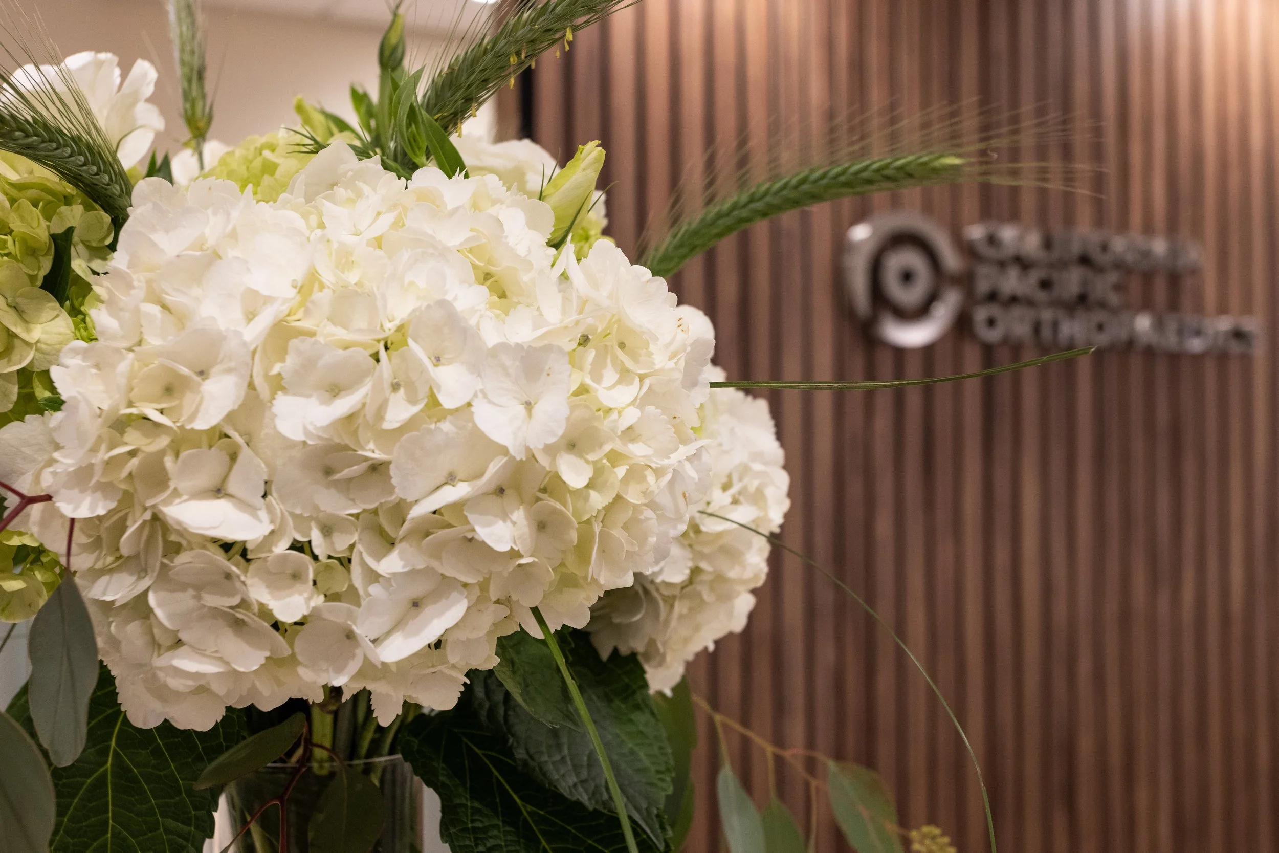
The primary goal of the project was to create a space that was relaxing first and foremost. I designed a palette inspired by nature with a deep ocean blue paint by Benjamin Moore, a hue that visually recedes making the lobby feel spacious, yet simultaneously cozy. The walnut wood slat walls by Soelberg on the column & reception desk both soften acoustics and offer a feeling of comfort and warmth. The custom-designed forest mural by LookWalls provides ‘larger scale artwork’ in a modern, fresh take, balancing the series of framed pieces to avoid visual clutter and allowing the eye to rest.
Illuminate
Lighting is one of the most impactful elements of an interior and I really enjoyed creating a various ‘moments’ of light throughout, even in a relatively compact space. First the ceiling tiles & sprinkler heads were all updated for a clean white canvas, and the new recessed fixtures, installed by Paganini Electric were spaced evenly in a small square size for both downlights & directional. I created a drywall soffit over the new reception desk with modern black pendants (careful not to obscure the signage), and coordinating table lamps by Kelly Wearstler. The modern style & black color offer a nice contrast to the light cream floors and transaction counter.
God is in the details.
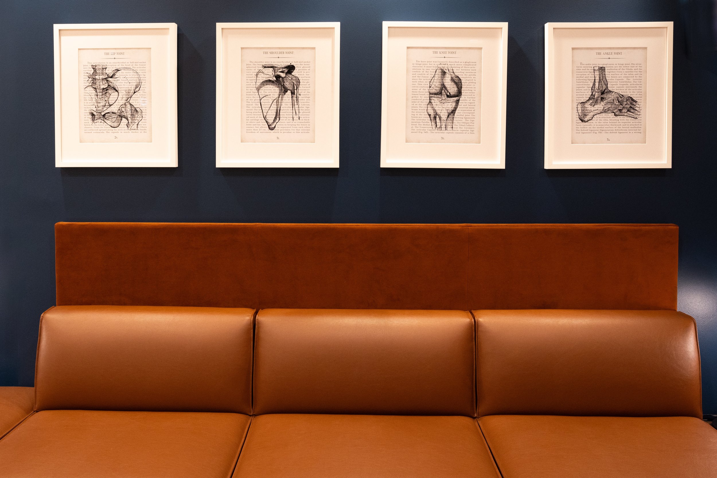
As Mies famously penned, “God is in the details”, yet oftentimes, these details get skipped over. I deeply believe in a holistic design approach and insisted on taking on these seemingly small (but hugely impactful) elements like custom signage fabricated by Martinelli Signage in a brushed aluminum raised letter, mounted elegantly on the wood slats, or new black & white x-ray artwork of various joints, custom framed artwork by City Picture Frame, and hand sanitizers decanted into new rough-hewn stone vessels with coordinating stone pen cups for patient sign in, echoing the nature theme.
Welcome!
When the project first began, the reception desk was not in the scope, but after a little cajoling, the client quickly agreed that there would be no wow moment in the transformation until the desk was updated. Outdated curved & peeling maroon laminate was replaced with neutral colorations in a streamlined linear shape, extended to accommodate another receptionist, and clad in updated yet classic walnut wood slats and a durable cream Corian transaction counter with hidden lighting. The result of this gorgeous millwork transformation by Mission Bell is stylish, understated, and elevated.
Let’s chat!
Ready to learn more about our Commercial Ancillary Design services and get to know each other? Cool. Easily schedule a free introductory phone call here and we can start the ball rolling! This is a brief 20-minute phone call where we can determine if we’re a fit for your particular project scope and budget, and of course answer any questions about the process you may have.
We look forward to meeting you!